
Small design and UX errors quietly drive potential customers away before they ever reach out. Here is what to look for — and how to fix it.
You built a website. You are proud of it. Maybe you paid good money for it.
But the leads are not coming in the way you expected. Visitors land on the page and leave. The phone is not ringing. The contact form sits empty.
Here is the uncomfortable truth: your website might be the problem. Not because it looks bad, necessarily. But because small design and UX mistakes, ones that are easy to miss from the inside, quietly drive potential customers away before they ever reach out.
After working with businesses across industries, from e-commerce brands to law firms to real estate agencies, we have seen the same mistakes come up again and again. Here are the five that hurt the most, and exactly how to fix them.
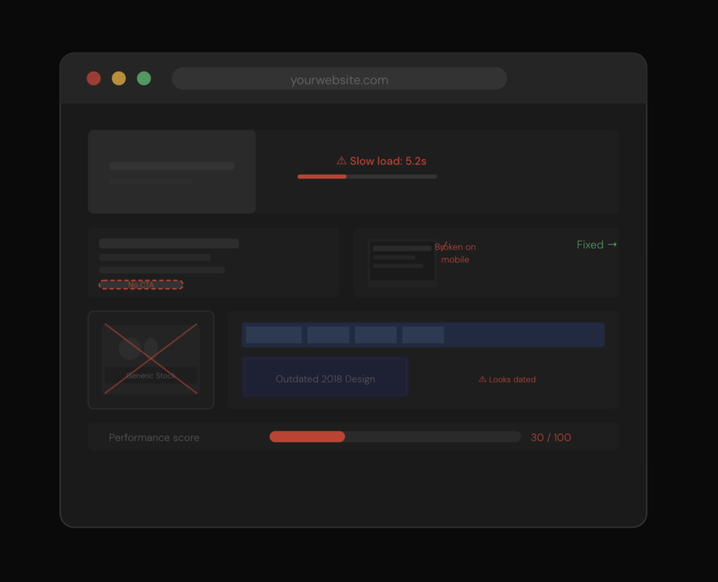
01 Your website loads too slowly
Speed is not a nice-to-have. It is a conversion factor.
Research consistently shows that a one-second delay in page load time can reduce conversions by around 7%. On mobile, the numbers are even worse, most users will abandon a page that takes longer than three seconds to load.
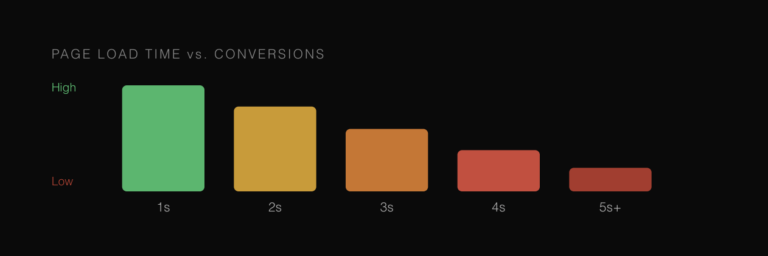
Think about what that means in practice. You could have a beautiful website, a great product, and a competitive price. But if the page takes five seconds to load, a significant share of your potential customers have already left and opened a competitor’s site.
What causes it
Oversized images, too many plugins, unoptimized code, cheap hosting, and scripts that block the page from rendering are the most common culprits.
How to fix it: Run your site through Google PageSpeed Insights (it is free) to get a specific list of what is slowing you down. The biggest wins usually come from compressing images, switching to a faster hosting provider, and reducing the number of third-party scripts loading on every page.
02 There is no clear call-to-action
Walk through your own website right now. On each page, ask yourself: what do I want a visitor to do next?
If the answer is not immediately obvious from looking at the page, you have a problem.
A website without a clear call-to-action (CTA) is like a salesperson who talks enthusiastically about a product and then just stops, no ask, no next step, no direction. Visitors who are interested but not sure what to do will simply leave.

What causes it
Designers often prioritize aesthetics over conversion. Pages get loaded with information, but the action you want the visitor to take gets buried or left vague.
How to fix it: Every page should have one primary action. Use specific language, not “Click here” but “Search available homes” or “Get a free quote.” Make the CTA button visible without scrolling and ensure it stands out visually from the rest of the page.
When we redesigned the HomeTowne Realty website, one of the first things we addressed was the CTA structure. The difference between a vague “Learn more” and a specific “Search available homes” is the difference between a bounce and a lead.
03 The site was not built mobile-first
More than half of all web traffic now comes from mobile devices. In some industries, restaurants, local services, retail the share is even higher.
Yet many websites are still fundamentally designed for desktop and then squeezed down to fit a phone screen. The result is small text, buttons that are hard to tap, images that do not load correctly, and navigation that becomes a frustrating maze on a small screen.
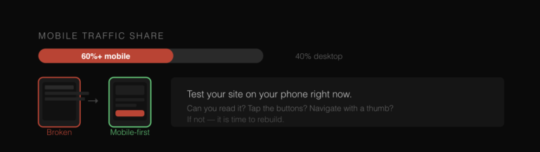
A visitor who struggles to use your website on their phone does not think “this site is hard to use on mobile.” They think “this company is not professional.” And they leave.
How to fix it: Test your website on your own phone right now. Can you read the text without zooming in? Can you tap the buttons easily? Does the navigation work with a thumb? If not, a mobile-first rebuild is essential. For every project at Strategic Influence Marketing, including the Chronessence e-commerce redesign, mobile is a first-class priority from day one.
04 You are relying on generic stock photos
This one is subtle but powerful. Generic stock photos, the ones with strangers shaking hands in a boardroom, do not build trust. Visitors have seen these images thousands of times. They register as noise, not content.
Worse, they send a quiet signal: this company did not invest enough to show you who they actually are. Authenticity matters enormously in how people make decisions online.
How to fix it: Even high-quality photos taken on a modern smartphone, in good light, of real people and real products, will outperform generic stock images. If you must use stock photos, choose ones that feel specific and human rather than staged and corporate.
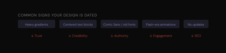
05 The design looks dated
Design trends move fast. A website that looked modern in 2019 can feel noticeably old today, and visitors notice, even if they cannot articulate why.
An outdated design does not just look bad. It sends a message about your business: that you have not been paying attention, that you are behind the times, or that you do not invest in your own brand.
How to fix it: You do not necessarily need to rebuild from scratch. A focused refresh updated typography, cleaner layout, better photography, and a streamlined navigation can dramatically modernize a site’s appearance. But if the underlying structure is more than four or five years old, a full redesign is often more efficient than patching.
The common thread
Look at these five mistakes together and you will notice something: they all come back to the same thing. Your website needs to work for your customers, not just look good to you.
Speed, clear direction, mobile experience, authentic imagery, modern design, these are all expressions of respect for the person on the other side of the screen. They signal that your business is professional, trustworthy, and worth the customer’s time and money.
The good news is that none of these problems are permanent. Every one of them is fixable, and fixing even one or two can have a measurable impact on the leads and revenue your website generates.
Not sure where your website stands?
We offer website audits that identify exactly where your site is losing visitors and revenue, covering speed, UX, mobile performance, conversion structure, and design.